IGS Rebrand: Why Rebranding Isn’t Just a New Logo
The Brief
When IGS reached out to [mg.limited], the brief was a brand refresh for a school moving into a new, larger campus. A reasonable ask. But we saw it as an opportunity to go further. IGS had been the German language boutique school in Ho Chi Minh City since 2012, known almost exclusively within the European expat community. With the German entry test removed and a new campus opening, the school was ready to welcome Vietnamese families. If IGS was going to invest in changing how it looked, it made sense to first revisit what it stood for. The school agreed, and a visual refresh became a full repositioning.
The Thinking
Through stakeholder interviews and an audit of eight competing schools, one thing became clear: IGS had real strengths it had never communicated. The concept of Lernlandschaft, an open learning environment where students work on projects at their own pace with close teacher guidance, was already central to how IGS taught. So was the bilingual model, the small group structure, and a direct pathway to tuition free German universities. These were genuine differentiators that lived inside the building but not in the brand.
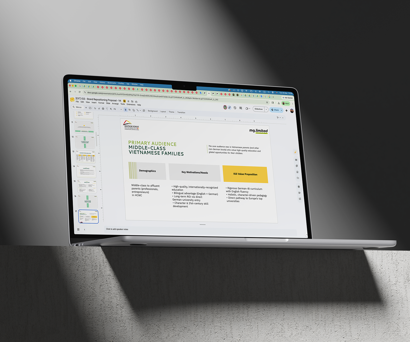
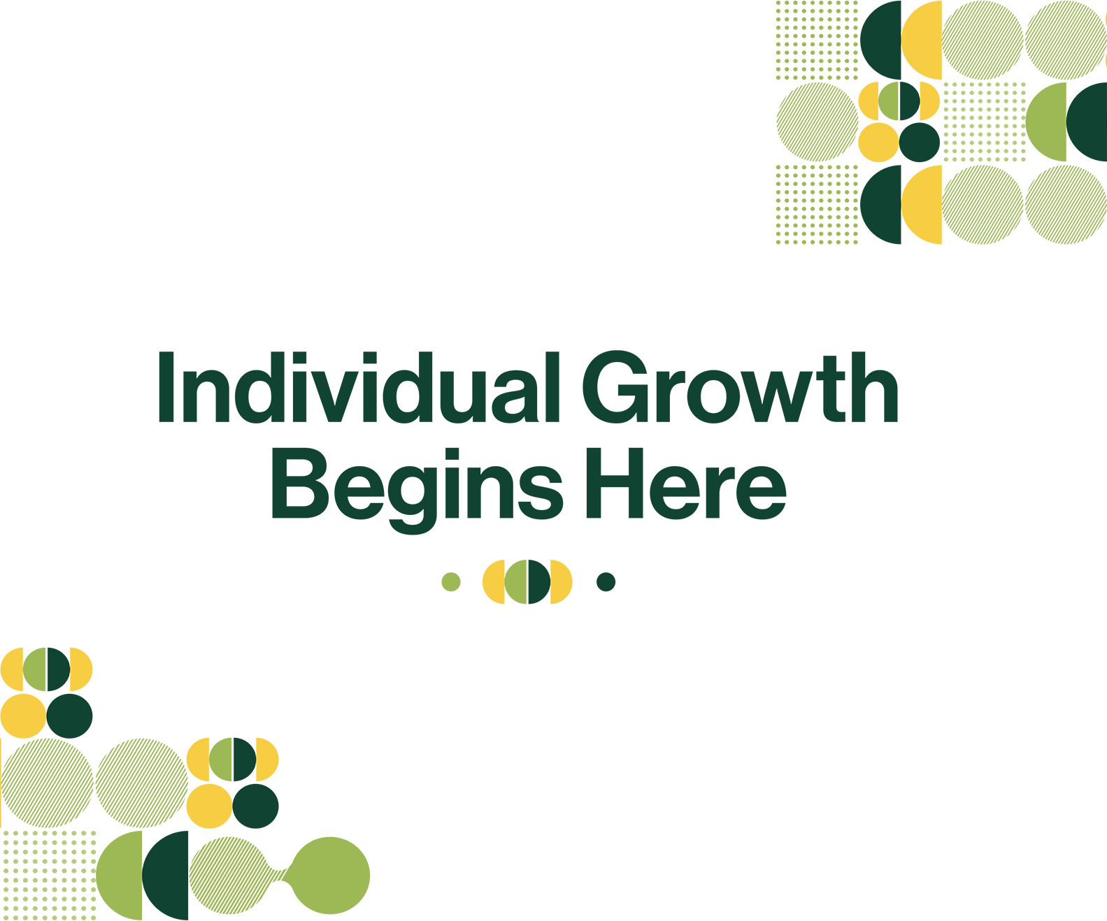
The positioning insight came from understanding what made this different in the Vietnamese context. In Vietnam, the default education model is mass structure applied uniformly to every student. What IGS practiced through Lernlandschaft was the opposite: teachers and students co-designing challenges based on the child’s pace, interests, and aptitude, with growth measured through projects and portfolios rather than standardized tests alone. This was a philosophy most Vietnamese parents had never encountered, and it became the foundation of everything we built together: “Individual Growth Begins Here”
The Work
The collaboration between [mg.limited] and the IGS team was close throughout. Together we developed a new logo that fuses a Vietnamese conical hat with the German flag colours, two cultures in one symbol. We built a colour system that shifts by school level, each tied to a stage of the child’s journey.
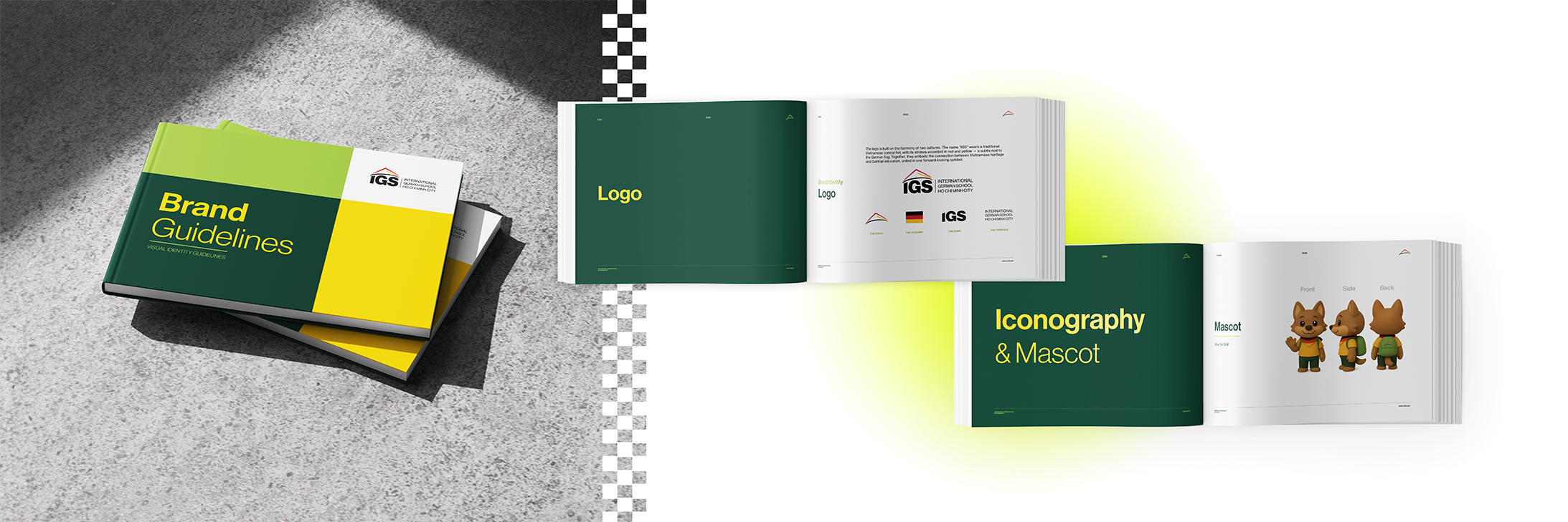
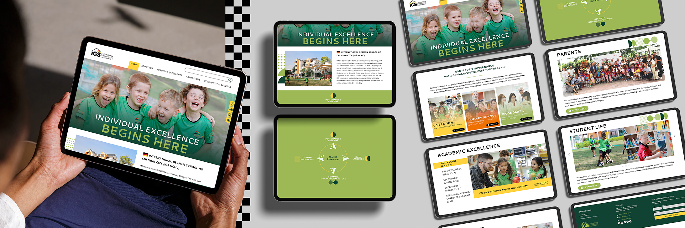
The brand book went beyond visuals to define tone of voice, photography direction, and a dual brand personality: the Guiding Mentor and the Disciplined Expert. The new website structured everything around four brand pillars, with each page answering the questions a Vietnamese parent would actually ask. A social media strategy and launch plan supported the rollout, introducing the new positioning gradually rather than announcing it all at once.
“Working with [mg.limited] felt like a genuine partnership from the start. They took the time to understand our school, our community, and what makes our approach to education different. The result is a brand that finally reflects who we actually are.”
What made this project work was not the final deliverables. It was the months of thinking that came before them, and the willingness from both sides to take a brand refresh further than it needed to go.
A brand is more than a logo. It is the thinking that decides what the logo needs to carry. If your brand is about to change, and you want that change to mean something beyond a new look, that conversation is where we start.